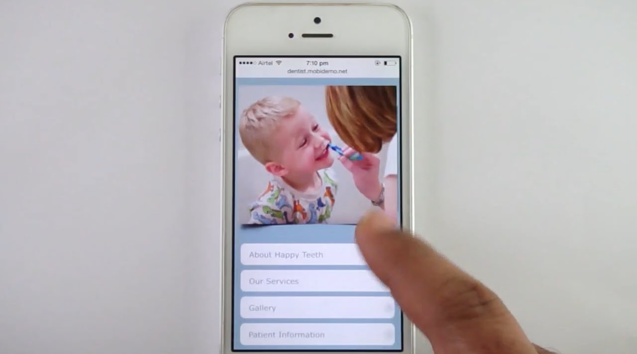
Today, people are on the go most of the time and about 74 percent of the visitors on your website are likely to be accessing it from a phone (Source – Google). What’s more, if those visitors don’t get a good impression of your site in the first five to eight seconds, they will continue searching until they find a dental site that makes them feel comfortable.
40% of patients turn to a competitor’s site after a bad mobile experience as stated by The Mobile Playbook, a resource guide from Google.
After reading all of this and also knowing that very few people actually make an appointment on their first visit to your dental website, you will want to give the visitors a reason to keep your practice in mind when they need dental services. Is your mobile website one that will appeal to visitors? Read on to find out what things make visitors cringe and how you can fix them.

What Makes Visitors Cringe
Not having a mobile website is basically a business killer these days. Having one that potential patients find difficult or annoying can be just as bad. There are many ways you can make a visitor/potential prospect unhappy at your site, including something as innocent-looking as the colors you use, but the most harmful are:
*Unprofessional-looking – An unprofessional website can put your credibility at stake! Apart from professional design and engaging content, it should also emphasize the benefits that make your practice stand out.
*Difficult to navigate – The navigation should work properly and your mobile site should position your dental practice as the best one in the local area.
*Text is too difficult to read – Text shouldn’t be small, or difficult to read, and all important business information should be laid out clearly.
*Website loads slowly – According to HubSpot, 64% of smartphone users expect pages to load in less than 4 seconds. Also, a one-second delay in your website load time means a 7% reduction in conversions.
*Buttons are too small –57% of users say they won’t recommend a business with a poorly designed mobile site (socPub). The buttons shouldn’t be small and too close together, rather they should be designed for fingers.
*Contacting is not easy – Make use of persuasive CTAs and make it easy for the prospects to contact your office.
Take a close look at your site with this list in mind. Is it guilty of any of these things? If so, continue on and we will discuss how to fix these issues.
What Creates a User-Friendly Mobile Site

Now that you have an idea of what you need to make your mobile website more user-friendly, here are ways you can fix the most common issues listed above.
1. Either research what makes a site look amateurish or hire a professional to design it. One of the biggest ways to make a site look unprofessional is to think that more is better. Minimal design is often the best way to go.
2. Can visitors find what they are looking for easily? Making your menus easy to navigate and listing exactly what a visitor will find when searching is the way to go. Keep scrolling and pinching to a minimum.
3. Small screens are harder to see, so keep your colors plain, with dark text on light backgrounds. Use plain fonts and get your point across in fewer words so you can make the text larger and easier to see.
4. Use only the graphics you absolutely need. Remember, space is minimal. Make every bit of it count for something. Graphics are the biggest culprits when it comes to slowing down the loading speed.
5. Keep buttons large enough so that fingers can easily click on them. Don’t put too many buttons close together because it increases the chances that your visitor will end up somewhere completely different than they wanted which increases frustration.
6. Install an app that allows customers to reach you by phone with only one-click. This way they don’t have to worry about remembering a number or having to look it up later. They might change their mind about contacting you if they have to wait.
Final Words
These tips will help you resolve the most common issues in your dental practice mobile site and will also help you convert more prospects into patients. Contact us today and let us assess your mobile website. Our experienced team can answer all your questions and have your mobile website up and running quicker than you thought is possible.


