Website is a predominantly visual medium that boasts of a target user base of 4.9 billion users. Further data suggests that there are over 1.8 billion websites online today. Clearly, making your website stand apart–visually or otherwise–in a scenario where a new website is literally going live every second is nothing short of a Herculean task.
This is why brands need to stay updated with the latest website design trends–ones that can empower them to design websites that are intuitive as well as user-friendly and facilitate a positive first impression among users right from the start. In this blog, we will look at the top-6 most useful web design tweaks you can make to appeal better (and smarter) to your target audience. Let’s jump right in.
6 Web Design Hacks to Improve Your Website’s UX
1. Live Chat Functionality for Instant, Real-Time Service
Customers today want instant, personalized, and prompt support, with 66% of customers wanting brands to offer them a good online customer experience. This is why integrating live chat software within your landing page can prove to be an effective investment. It can not only empower your brand to offer more friendly customer support but also allow customers to get the desired answers in no time.
Take a look at Modcloth’s live chat feature where consumers can interact with live agents, a.k.a., a ‘Modcloth advocate’ one-on-one, thereby paving the way for a more personalized user experience:
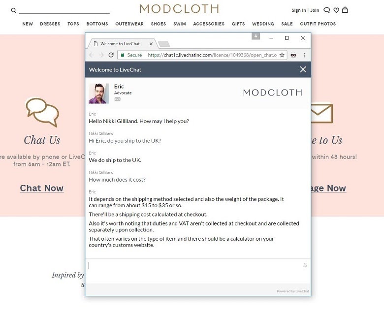
The learning: If you want to offer real-time, quick, and personalized customer support, live chat is the way to go.
2. Focus on Keeping the Design Minimal and Simple
When it comes to designing your website, it is easy to get carried away and feel the need to add multiple elements to wow the users–a big mistake. Doing so can make your website look like an afterthought or chaotic and cluttered. Instead, designers should focus on including critical elements that serve a real purpose on the website and get rid of all unnecessary distractions that might be causing more harm than good.
A web designer in the Philippines says that your end goal should always be to create a functional and user-friendly website that makes the user’s experience easy and simple, as Airbnb’s website demonstrates below:
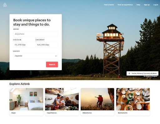
The website only includes important elements such as a search box, search results page, ratings, reviews, and references, super host details to name a few.
The learning: You should aim at reducing friction at every point of your user’s journey as they browse through your website and allow them to navigate as quickly and effortlessly as possible.
3. Select Colors that Align with your Brand’s Positioning
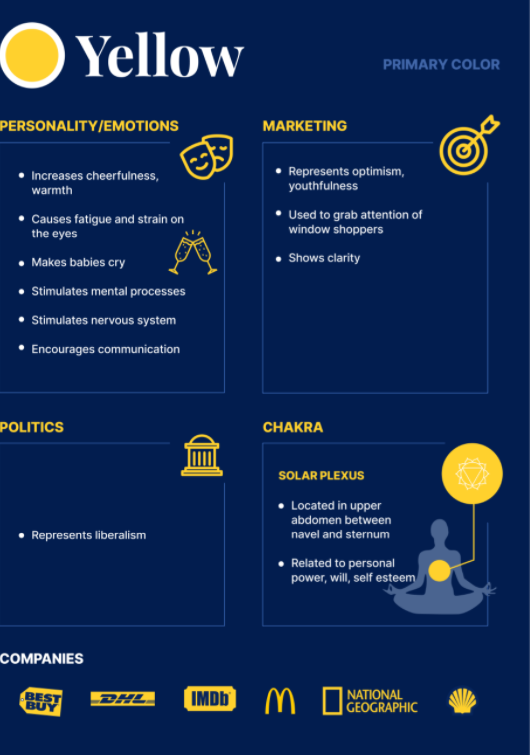
Did you know that colors can impact the way people perceive your brand? According to research, 80% of customers think color boosts brand recognition. Additionally, every color has a different meaning and is associated with a different set of emotions that it can invoke in the reader. For instance, the color yellow invokes feelings of warmth and friendliness:
If we were to take an example of a real-life brand, we’d look at Dunkin Donut’s website, which uses the brand’s dominating color scheme–orange and pink–to ensure a consistent and uniform user experience:
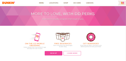
The learning: Keeping your colors representative of the brand and clearly communicating your brand’s identity can deliver a seamless and cohesive user experience across all channels of communication, be it online or offline.
4. Add Custom-Made Visual Elements
Visual elements act as the bread and butter for your website–from infographics and real-life photography to videos and sketches, there’s much you can experiment with. Take a look at Zenefits website, which highlights video testimonials and uses real-life images to provide a glimpse into the company’s culture and make it more humane in the customer’s eyes:
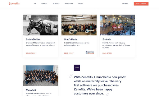
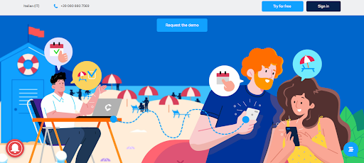
The learning: Whatever you do, stay away from generic stock images that make your website look templatized and boring. You can also make use of hand-drawn illustrations, as Coco Business’ website demonstrates below:
5. Make it Mobile Optimized
Mobile optimization has emerged as a must-have for websites today. With over 3 billion people using the smartphone, not making your website mobile responsive can be a missed opportunity of gigantic proportions. Web designers should factor in the user’s screen size, platform, and orientation to ensure that the mobile is optimized for all devices and platforms that their customers frequent.
What brands need to keep in mind is that their website’s look-and-feel should be visually consistent with other channels of communication such as an app, for instance. Chili’s is an excellent example of this:

Chili’s Mobile App Interface

Chili’s Desktop Interface
The learning: At the end of the day, you want to provide a seamless user experience, keeping the website aesthetics as consistent as possible across channels and devices.
6. Keep your End-User in Mind when Designing
Since a value-driven website is ever-evolving and dynamic, it helps to keep the end-user in mind when designing. Walk in the user’s shoes to understand their likes, dislikes, friction points, etc., so that you can use the website to build loyalty and trust. Elements such as navigation, content, layout, white space, and so on should always be conceptualized, keeping your customer in mind. This is why creating a solid and well-researched user profile can lend a helping hand.
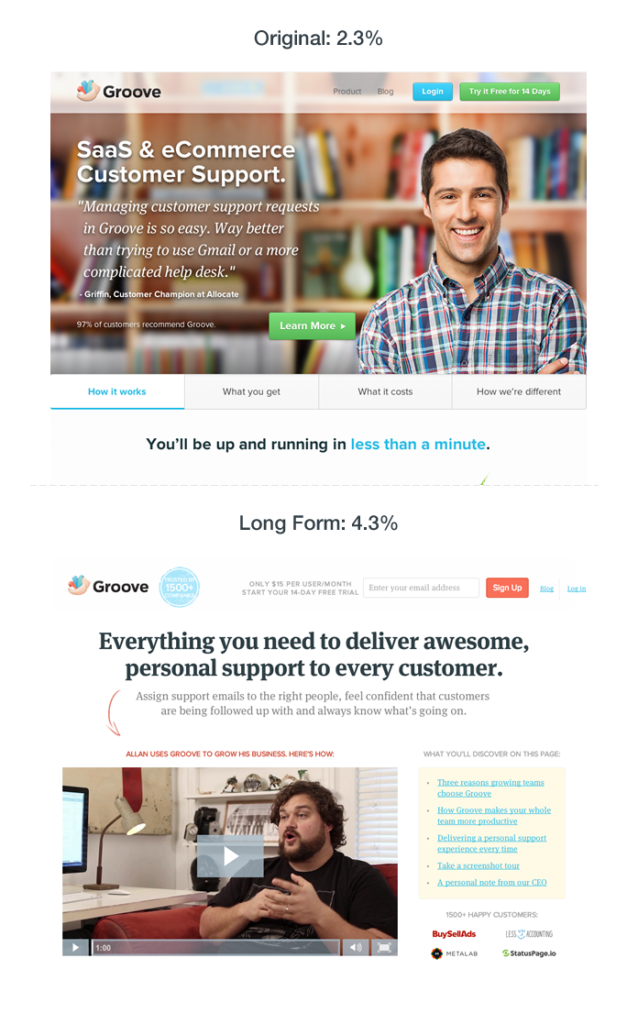
The learning: If you are unsure of where to begin, do a couple of sample designs and engage in A/B testing to see which option seems to be working best. You can also do market research and conduct qualitative interviews to get a better pulse of your customer’s needs. Take a look at Groove’s use case, which made tweaks to its website messaging via results obtained from A/B testing and ultimately doubled their conversions to 4.7%:
Closing Thoughts
Think of your website’s design as integral to creating a powerful and positive first impression in the user’s mind. Also, remember that there’s no set formula or a “one size fits all” strategy that works for all websites.
What you need to do is zero in on your website’s goals and understand its core purpose, and then strategize on ways to optimize your website’s aesthetics, keeping users at the heart of the offering. Use the tips outlined above and kickstart your web designing journey with the right foundation in place. Thoughts?


